The most effective way to create flow from room to room with color is to select a unifying neutral foundation that runs continuously through main living spaces, then layer in carefully curated accent colors that shift subtly in tone and saturation to define each area’s purpose while maintaining visual connection. This approach eliminates jarring transitions, makes your home feel larger and more intentional, and boosts daily comfort. In a San Jose residence where open-plan layouts and abundant natural light are common, this strategy is not only achievable—it’s essential for a home that feels both expansive and intimately yours.
We’ve designed and built countless whole-home renovations across San Jose, and time and again, clients tell us color continuity was the single most transformative decision in their project. As a family-owned design-build firm, LeCut Construction brings a builder’s practicality and a designer’s eye to every square foot. We know that color isn’t just decoration; it’s a structural tool that shapes how you experience your home.
Table of Contents
Why Color Flow Matters More Than You Think
When we walk through a home that’s been poorly planned—rooms painted in isolation without considering sightlines—we physically feel the disconnection. One room screams cool gray while the next whispers warm beige. The result? Visual noise. Your eye stumbles instead of gliding. Conversely, a well-planned color scheme guides you effortlessly, reduces subconscious stress, and enhances the architectural features you’ve invested in.
Color flow isn’t about painting every wall the same shade. It’s about creating a family of colors that relate to one another on the color wheel and share an undertone. In our projects, we often use a single white or soft greige for all hallways, ceilings, and trim to act as a connective tissue. Then, each room receives its own hue—a deeper tone from the same color strip, or a muted complementary color that shares that underlying warmth or coolness.
San Jose Light & Lifestyle: Unique Factors You Must Address
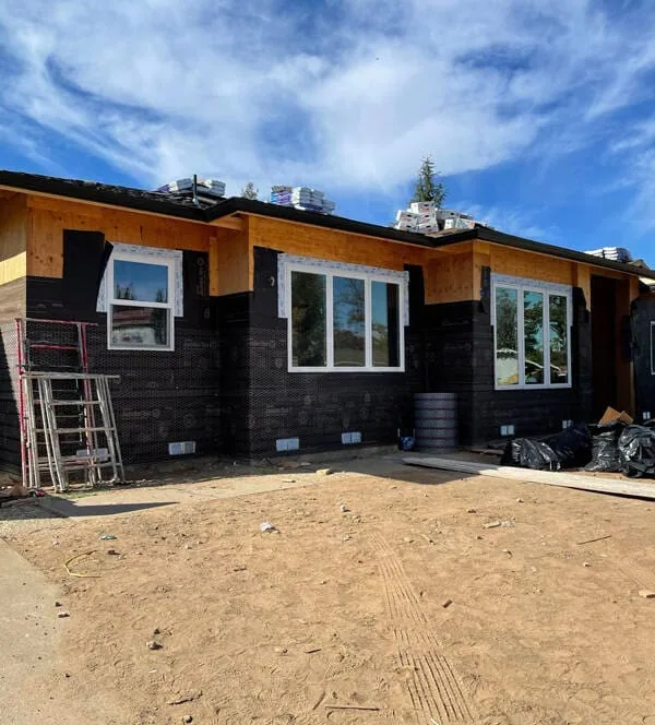
Your San Jose home presents specific opportunities and challenges. The region’s intense natural light can wash out pale colors or make saturated hues feel overwhelming. Open-plan kitchens that flow into living and dining areas—common in mid-century and newer builds—demand a thoughtful approach to color zoning. We always sample paint on multiple walls and observe it at different times of day under LED and natural light before finalizing. The goal is a color that holds its integrity from morning sun to evening lamplight.
Table: How San Jose Natural Light Affects Color Perception
| Time of Day | Light Quality | Color Impact | Recommended Adjustment |
|---|---|---|---|
| Morning (East-facing) | Cool, crisp sunlight | Blues and greens appear brighter; warm tones may look dull | Use slightly warmer whites, avoid pastel cool colors unless balanced |
| Afternoon (West-facing) | Warm, golden light | Amplifies yellow and orange undertones; grays can look beige | Choose complex neutrals with green or violet undertones to neutralize excess warmth |
| Evening artificial LED (3000K) | Soft warm white | Makes spaces feel cozy but can muddy cooler colors | Test colors under 3000K bulbs; ensure accent walls retain depth |
| Overcast / Foggy days (common in San Jose winters) | Diffused, cool light | All colors lose vibrancy; contrast decreases | Incorporate satin or eggshell finishes to reflect light; use deeper mid-tones on feature walls |
Our Proven 4-Step System for Perfect Color Flow
At LeCut Construction, we’ve refined a design-build process that embeds color planning right into the architectural conversation. Here’s how we guide you:
1. Identify the Home’s Anchor Color
We start by selecting one neutral that will run through hallways, stairwells, and open transitions. This is typically a warm off-white or soft greige that complements your fixed elements: flooring, countertops, and cabinetry. We’ve found that a light reflectance value (LRV) between 60 and 75 offers enough brightness without glare.
2. Build a Color Story, Not a Color Match
For adjacent rooms visible from the main living area, we choose colors that share the same undertone. For example, a dining room in a soft sage green (green-gray undertone) flows seamlessly into a living room in a warm taupe with a hint of green. We avoid jumping from a pink-beige to a blue-gray because the clash registers even if you can’t articulate why.
3. Use Architectural Casing and Trim as Intentional Breaks
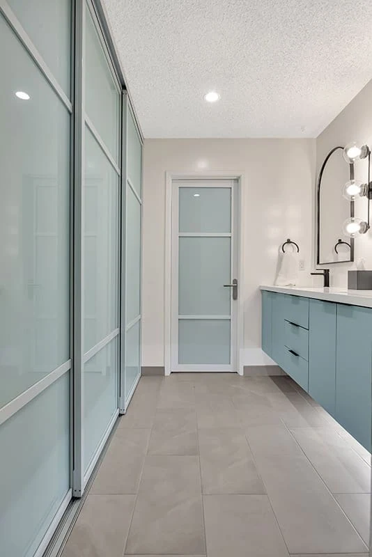
We often design wider door casings, bulkheads, or ceiling beam details that provide a physical break where a color change makes sense. This allows you to introduce bolder accents—a deep teal home office or a terracotta powder room—without visual chaos. The trim acts as a picture frame, containing the color within that room.
4. Connect Through Ceilings and Flooring
Ceilings are the fifth wall. Continuing the same ceiling white throughout the home ties everything together above eye level. On the floor, consistent flooring material (engineered hardwood, luxury vinyl plank) running through main areas erases boundaries. In an open-plan San Jose ranch we remodeled, a continuous white oak floor and “Simply White” ceilings allowed us to paint the kitchen island a dramatic navy while the living room walls remained a serene warm gray; the space felt unified because the top and bottom planes never changed.
Common Mistakes That Disrupt Flow (And How We Fix Them)
-
Mistake: Painting a small powder room a bright, unexpected color with no link to the adjacent hallway.
Fix: We borrow an accent color from a rug, artwork, or even a pillow in the living room and use it on the powder room walls, slightly deeper or lighter. That creates a subconscious link. -
Mistake: Using different whites throughout the house.
Fix: We specify one white for all trim, doors, and ceilings—Benjamin Moore White Dove or Sherwin-Williams Pure White are reliable choices. All our painters work from a single specification to avoid the “50 shades of white” problem. -
Mistake: Ignoring sightlines when planning wall colors.
Fix: During the design phase, we stand at key vantage points—the foyer, the kitchen sink, the primary bedroom door—and map exactly what walls are visible. Those walls get the connecting neutral, while hidden walls can hold stronger colors.
How an Integrated Design-Build Team Elevates Color Execution
You might wonder why a construction company is talking about color theory. Because we’ve learned that the most breathtaking renovation can feel off if the color scheme isn’t integrated with the build. As a design-build firm, LeCut Construction doesn’t hand off a plan and walk away. Our in-house team coordinates paint selections with millwork finishes, tile installations, and lighting placement—all under one roof. That means no finger-pointing, no lost information. We physically review large painted samples on your walls before the project starts, adjusting sheen and hue to look perfect with the exact cabinetry stain we’re installing.
We understand that color isn’t just pigment; it’s the first thing you notice about a room and the last thing you should have to worry about. Your San Jose home deserves a palette that feels intentionally crafted, not accidentally collected. Our clients often tell us the color flow we created was the detail their guests compliment most.
Budget-Conscious Ways to Create Flow Through Color
If a full-scale renovation isn’t immediate, we recommend these high-impact, lower-cost approaches that we’ve used for clients on a phased renovation plan:
-
Repaint all connecting hallways, the foyer, and the main living area ceiling in the same neutral to instantly connect disparate rooms.
-
Change out switch plates, outlet covers, and air vent covers to a consistent finish (matte white or brushed nickel) to remove visual static.
-
Use the same color for all interior doors throughout the house—a soft black or a warm charcoal creates continuity even when wall colors vary.
-
Add a unifying element like a narrow ledge shelf painted the trim color that runs through multiple rooms, carrying the visual line.
Frequently Asked Questions
What is the best paint finish to maintain color flow in a busy San Jose household?
We recommend eggshell for most walls because it offers a subtle sheen that reflects light gently without highlighting imperfections. For high-traffic hallways and kids’ rooms, a satin finish provides durability and wipeability while still looking cohesive. Avoid mixing matte and high-gloss on adjacent walls as the light reflection difference can break flow visually.
How do I make an open-plan living, dining, and kitchen feel distinct but connected?
Use a single neutral base on all large wall surfaces. Then define zones through color on island cabinetry, a feature wall behind the dining table, or a painted ceiling tray in the living area. The key is to use colors from the same temperature family—warm off-whites with terracotta accents, or cool greiges with slate blue accents.
Can I use dark colors and still maintain flow?
Absolutely. We love deep, moody hues in homes with tall ceilings and ample natural light. The secret is to anchor the dark color in a single defined room and use a medium-toned version of that color in the adjoining hallway or as an accent inside a built-in bookcase visible from the light neutral space. This creates a gradient effect that reads as intentional and sophisticated.
How often should I repaint to keep my home looking current in 2026 and beyond?
In the Bay Area climate, interior paint in high-use areas typically lasts 5 to 7 years before noticeable wear. From a style perspective, a well-chosen timeless neutral will serve you for a decade. We advise updating accent colors every 3 to 5 years to incorporate fresh trends—currently we’re seeing soft clay and mineral green accents—without redoing the whole house. This keeps your home feeling current with minimal cost.
Does color flow affect resale value in San Jose?
Yes, significantly. In competitive markets like San Jose, buyers react to homes that feel move-in ready and thoughtfully designed. A disjointed color scheme subconsciously suggests deferred maintenance. We’ve had clients who implemented our color flow plan and received offers thousands of dollars over asking, with buyer feedback specifically mentioning how “cohesive and spacious” the home felt.
Real-World Result: A Willow Glen Whole-Home Transformation
We recently completed a whole-home renovation in San Jose’s Willow Glen neighborhood where the original 1970s layout had compartmentalized rooms each painted a different era’s trend. The client wanted a modern, airy feel but was nervous about losing character. We removed two non-load-bearing walls, opened the kitchen to the living and dining, and applied our anchor neutral—Sherwin-Williams Alabaster—to all main walls. The kitchen island got a deep forest green, echoed by the dining room chairs and a statement wall in the powder room visible down the hall. Continuous white oak flooring and white ceiling unified everything. The result: a 2,200-square-foot home that now feels like 3,000 square feet, with each space gently announcing its identity without shouting. The project came in on budget at 185,000 dollars, and the family tells us they still pause every morning to appreciate the calm.
Why San Jose Homeowners Choose LeCut Construction for Design-Build Color and Flow Expertise
We’re a family-owned and operated firm rooted in the San Francisco Bay Area. Every project—whether a kitchen and bathroom remodel, a whole-home renovation, or a custom addition—receives our complete commitment to quality, integrity, and respect for your vision and investment. Our design-build process means you have a single point of accountability from concept to completion. We don’t just pick paint chips; we understand how walls, light, and space work together because we’ve built them all.
Because the majority of our business comes from client referrals, our reputation for reliability and satisfaction is earned on every single job site. Fully licensed and insured, we proudly serve San Jose, San Francisco, Oakland, and surrounding communities.
Ready to create a home where color flows as beautifully as your daily life? Schedule your free design consultation today by calling us at (408) 816-3688. Let’s walk through your San Jose residence together and map out a palette that unifies, delights, and lasts.
Sources consulted in our color planning approach include the color theory guides from Benjamin Moore and Sherwin-Williams, the Illuminating Engineering Society’s recommended practices for residential lighting and surface reflectance, and our own extensive field experience across hundreds of Bay Area renovations.
Related Articles
Complete House Remodeling
San Jose Whole Home Remodeling Contractor | Local Renovation Experts
Gallery Wall Design Tips For Newly Painted San Jose Hallways
Achieving A Cohesive Look Throughout Your San Jose Home
Top 10 Home Renovation Trends in Silicon Valley for 2026
Comfort & usability in small apartments
People Also Ask
To create a seamless flow of paint colors between rooms, start by selecting a neutral base color, such as a warm greige or soft white, and use it as a consistent backdrop in all connecting spaces. Then, choose a cohesive color palette of two to three accent hues that share a similar undertone, like warm yellows or cool blues. Apply these accent colors in varying intensities—for example, a bold shade on an accent wall in one room and a lighter version on trim or furniture in the next. This technique creates visual harmony without monotony. For professional advice on integrating this approach into your specific home layout, refer to our internal article titled The Ultimate Guide To Eichler Home Remodeling In San Jose, which offers tailored insights for San Jose properties.
The 3-5-7 rule in interior design is a guideline for creating visually appealing arrangements. It suggests that odd numbers of items, specifically groups of three, five, or seven, are more dynamic and memorable than even-numbered groupings. This principle works because odd numbers encourage the eye to move around the composition, creating a sense of balance without being too symmetrical. For example, placing three decorative vases on a mantel or five throw pillows on a sofa can add depth and interest. At Lecut Construction, we often apply this rule to help clients achieve a professional, curated look in their San Jose homes. The key is to vary the height, texture, and size of the objects within the group to maintain harmony and avoid clutter.
The 80/20 rule for color, also known as the Pareto Principle in design, suggests that 80 percent of a space should be dominated by a neutral or primary color, while the remaining 20 percent should feature a bold accent or secondary color. This balance creates visual harmony without overwhelming the eye. For example, in a room, walls and large furniture might be a soft beige or gray, while throw pillows, artwork, or a single feature wall use a vibrant hue. At Lecut Construction, we often apply this principle to help clients achieve a cohesive and professional look in their projects, ensuring the accent color draws attention without clashing. This rule is a reliable guideline for any interior or exterior color scheme.
To transition color between rooms, use a cohesive approach by selecting a neutral base color, such as soft gray or beige, that appears in both spaces. Then, introduce a complementary accent color on an accent wall or through decor elements like trim, artwork, or textiles. For a smooth flow, consider using a gradual shift from a lighter shade in one room to a deeper tone in the next, or repeat a key color in varying intensities. Another effective method is to use a transition area, like a hallway, where colors blend through a third shade that ties both rooms together. This ensures visual harmony without abrupt changes, creating a unified look throughout your home.
A consistent color scheme throughout your home can create a seamless flow and a sense of spaciousness, which is a popular approach in modern design. Using a unified palette from room to room helps the eye travel smoothly, making a smaller house feel larger. However, this does not mean every room must be identical. You can vary the intensity of your chosen colors. For example, use a lighter shade in the living room and a deeper, more saturated version in the dining area. The key is to maintain a cohesive undertone. For a comprehensive guide on planning this, our internal article titled Complete House Remodeling offers excellent strategies for balancing continuity with distinct room identities.
Selecting a cohesive paint color palette for your home is essential for creating a harmonious flow. The key is to choose a unifying neutral, such as a warm greige or soft beige, that can serve as a base in your main living areas. You can then introduce accent colors in adjacent rooms that share an undertone with this base, ensuring a seamless visual transition. For example, a light gray in the living room can flow beautifully into a soft blue-gray in a hallway. For specific guidance on tying together your newly painted spaces, we recommend reviewing our internal article Gallery Wall Design Tips For Newly Painted San Jose Hallways. Lecut Construction advises using a fan deck to compare colors under your home's natural light before making a final decision.